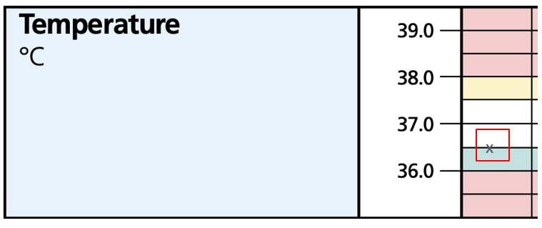
What if the value plots on the line?
Observations that plot on the line e.g., a temperature of 36.5C, fall within the score of the box above the line, so for this example 36.5C sits on the line between the hypothermia blue boxes and the normal range white boxes and is therefore a normal observation and scored as zero.

How does the NEWTT2 tool work with the KP Risk calculator / NICE Categorical Framework?
While the majority of newborn infants require only short-term surveillance, there are groups at risk of developing complications particular to the perinatal period. These groups should have additional observations tracked using the NEWTT2 tool. One type of ‘at-risk group’ is infants at risk of early neonatal infection.
The Kaiser Permanente Sepsis Risk Calculator and the NICE categorical framework are tools to determine the risk of early onset infection in newborn babies. (Please refer to relevant national and local guidance to ensure you are using these tools appropriately.) These two tools can be used to determine which babies need additional observations. The NEWTT2 chart can then be used to track these observations and provides recommendations on escalation where necessary.
How should assessment for cyanosis be recorded on the NEWTT2 chart?
Whilst the NEWTT2 working group recognise that pulse oximetry is the gold standard when assessing newborns for potential cyanosis, this is not yet available in all hospital or home birth settings and so the NEWTT2 chart continues to allow visual inspection of colour to be documented when this is not possible. We would like to highlight the need to be particularly vigilant when assessing for cyanosis in babies with darker skin tones and have updated our guidance to reflect this.
Pulse oximetry, and specifically post-ductal oxygen saturations, should always be used where possible and we would encourage all staff using paper charts to document the precise post-ductal oxygen saturation value on the chart. We would also encourage users to document precise glucose values on the chart when measured, but for other numerical variables (heart rate, respiratory rate and temperature) a dot or a cross should be used to plot the value on the chart.


